Do you ever say to yourself, “Why did they do that?” when you visit a website? That’s the exact concept that comes to mind when it comes to website design trends. What makes a certain element work (or not) and why did it become so popular so quickly? This month’s roundup has that as its subject.
This month’s design trends are listed below:
1. Design that is light and whimsical
Even for significant or serious material, lighter, more whimsical styles are popular. It’s an unusual mix of design and substance, and one that we don’t see very frequently.
These aspects are common in designs with “heavy content” and information with a light aesthetic:
-
- Palettes with lighter colours
-
- Font choices that are unusual and possibly experimental
-
- Animation and movement
-
- Characters or shapes from cartoons
-
- The overall design has a childlike quality to it.
-
- There are no photos or videos of people.
-
- Once you start reading, you will find serious content.
The most startling aspect of this design trend is the last item. You’d assume light content or information design for youngsters based on the look alone. In certain cases, however, it is not the case.
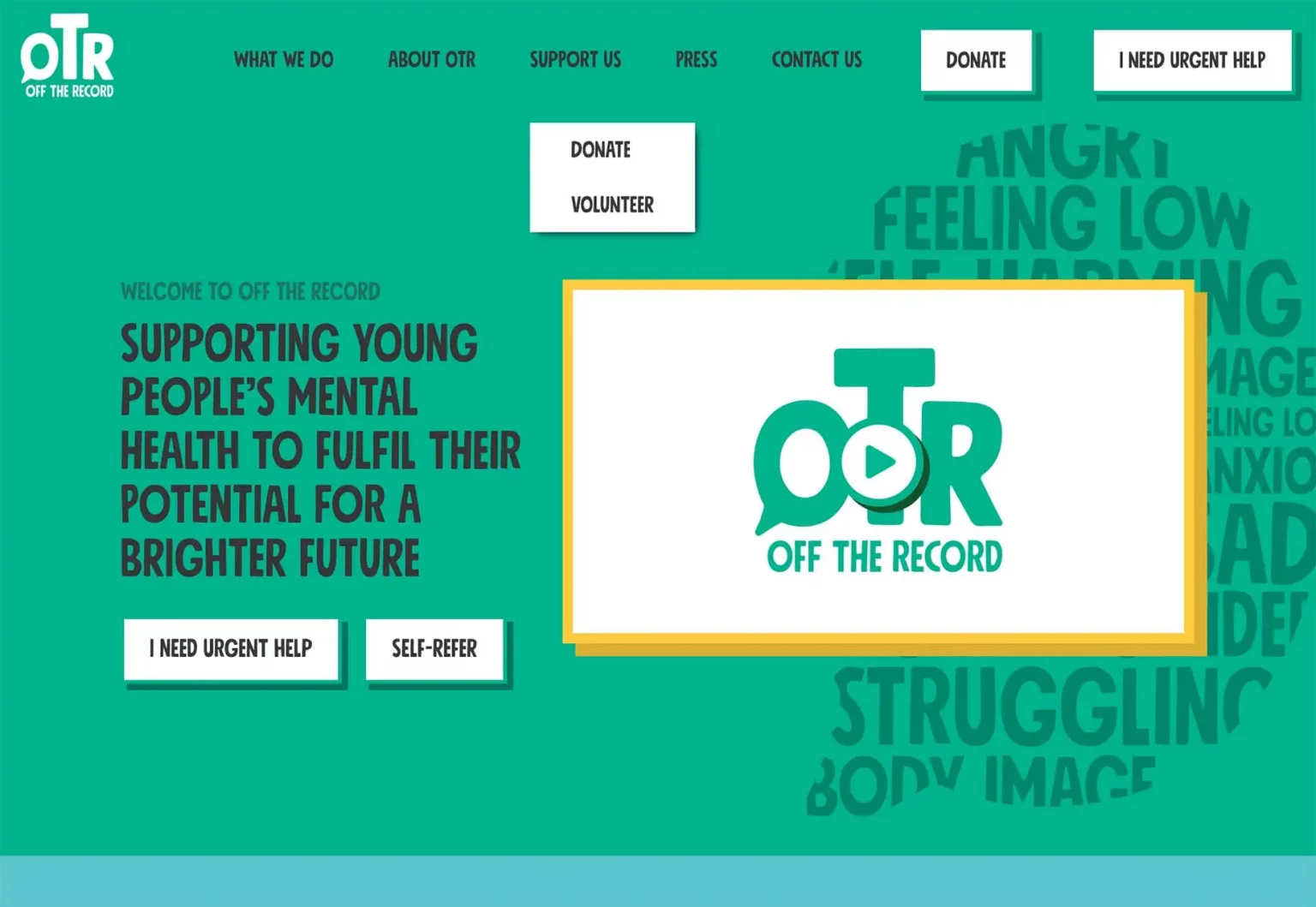
OTR South is for youth mental health resources. The design has a youthful air about it, but the content and matter are rather serious.
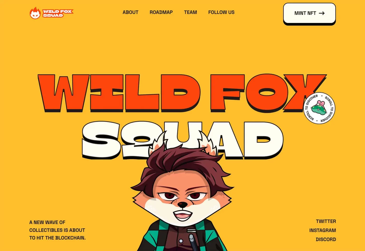
Wild Fox Squad is a pre-launch site where you’ll be asked to purchase NFTs.
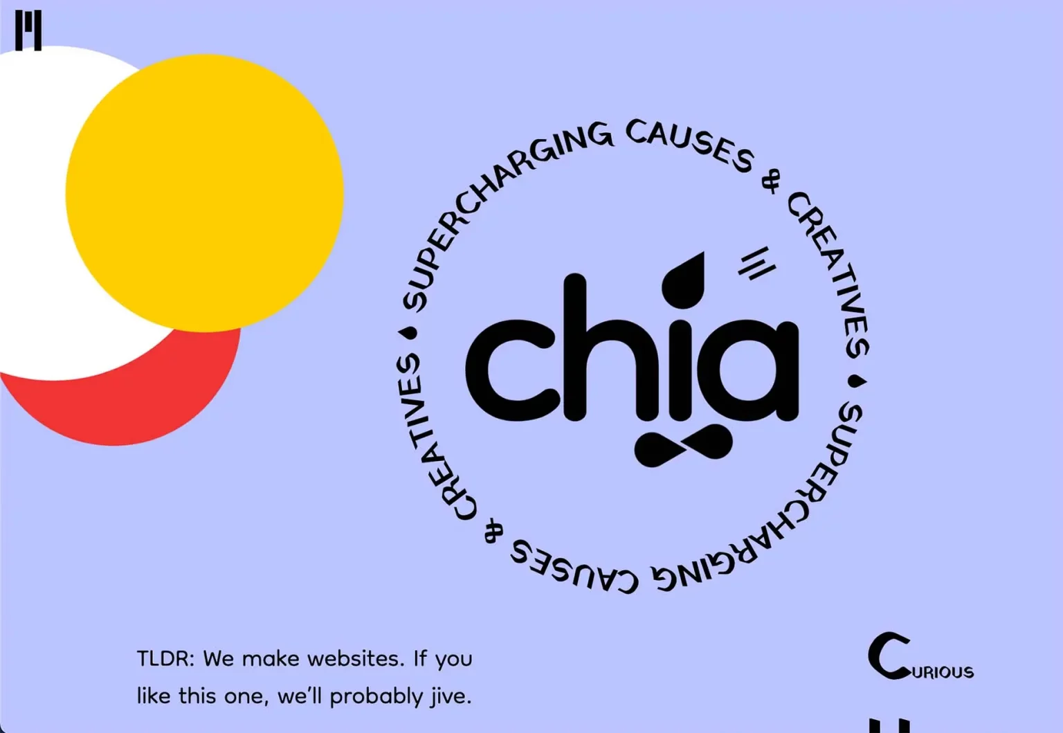
Chia Studios is a web development firm.
Does the aesthetic tone sync enough with the content to produce the correct feel or credibility to engage with the website, do business with the organisation, or even buy something online, as this trend suggests?
2. Animation on Long Scroll
You might not notice anything going on with any of these website design examples at first glance. However, when you interact with the sites, you’ll notice a common theme: the homepages all have long scrolling with a motion from top to bottom.
Long scrolling is one of those website design subjects and trends about which people are often passionate. It’s popular among some folks. Others despise it.
The problem with long scrolling is this. If anything takes a long time to scroll on a desktop, it will take an eternity on a smaller screen unless you remove a lot of stuff. That poses the question: if the homepage is particularly long, will consumers view and read what you need them to see and read?
Here’s an example of how each of these instances combines extended scrolling and animation.
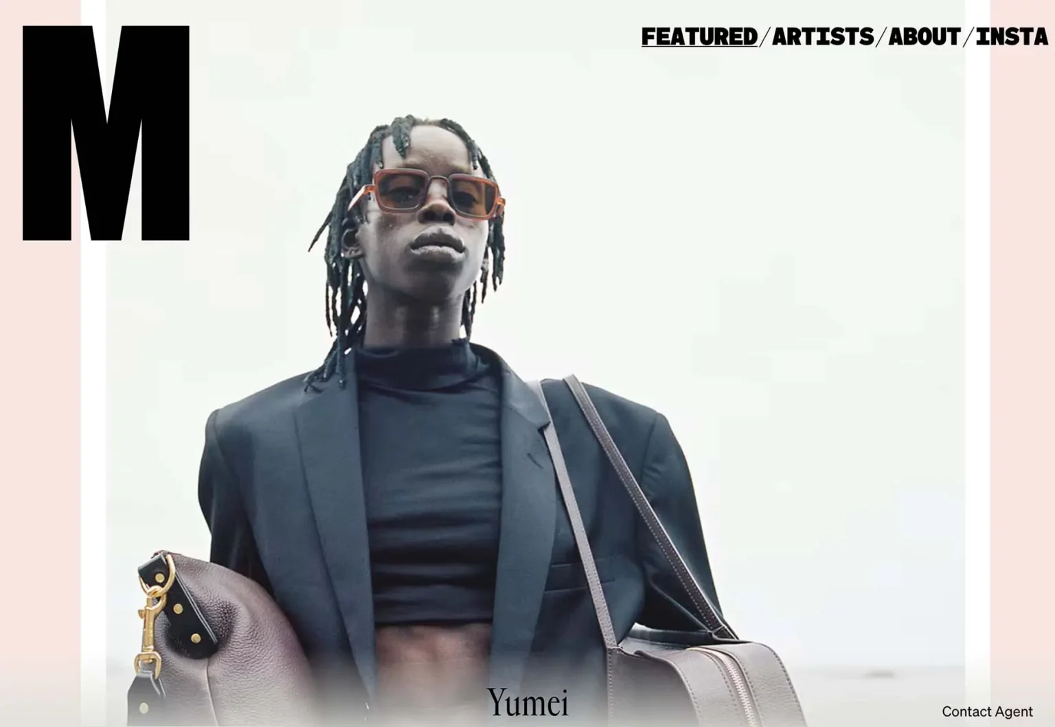
As the site loads, Match Artists begins to animate before switching to a static home screen. Photos grow in the frame with a gentle movement as you navigate. This webpage looks to be more dynamic the faster you scroll. The image-scroll-animation combination is easy to consume because there isn’t much to read.
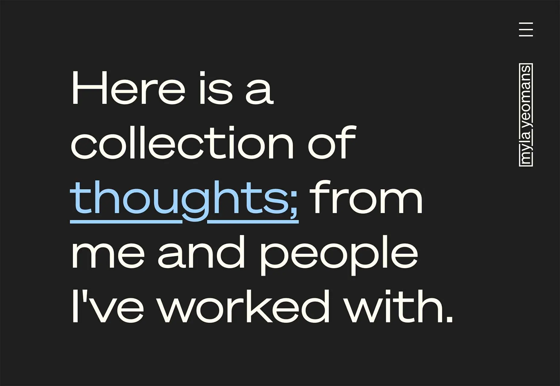
Myla Yeomans‘ home scroll is nearly empty, yet it transitions into a text-heavy scroll (seen below), with each scrolled screen changing colour with motion. Because of the size and volume of text in the design, the effects aren’t harsh, but they can cause motion sickness unless you scroll slowly.
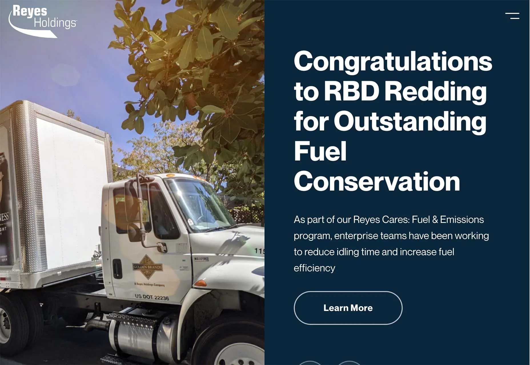
Reyes Holdings may have the busiest animated scroll of all the companies on our list. As pieces appear to stream in from practically every direction, there are slider movements that move left to right for content in the hero area, as well as parallax and loading scroll animations down the page.
3. The Colour Pink
Pink is a colour trend that evokes a variety of powerful emotions. Before a consumer even engages with the site, the colour alone can make judgments about the design or content.
When using a hue like this in a design, you must consider the baggage that may be associated with it, whether you agree with it or not.
Pink is generally associated with femininity, and the soft pink in some of these images is associated with babies. It’s also not often seen as a bold colour. Sweetness, health, romanticism, and purity are all common connotations and associations with the colour pink. When using this colour in your design, all of those ideas should be taken into account. Keeping this in mind, each of these websites employs the pink colour trend in a unique way.
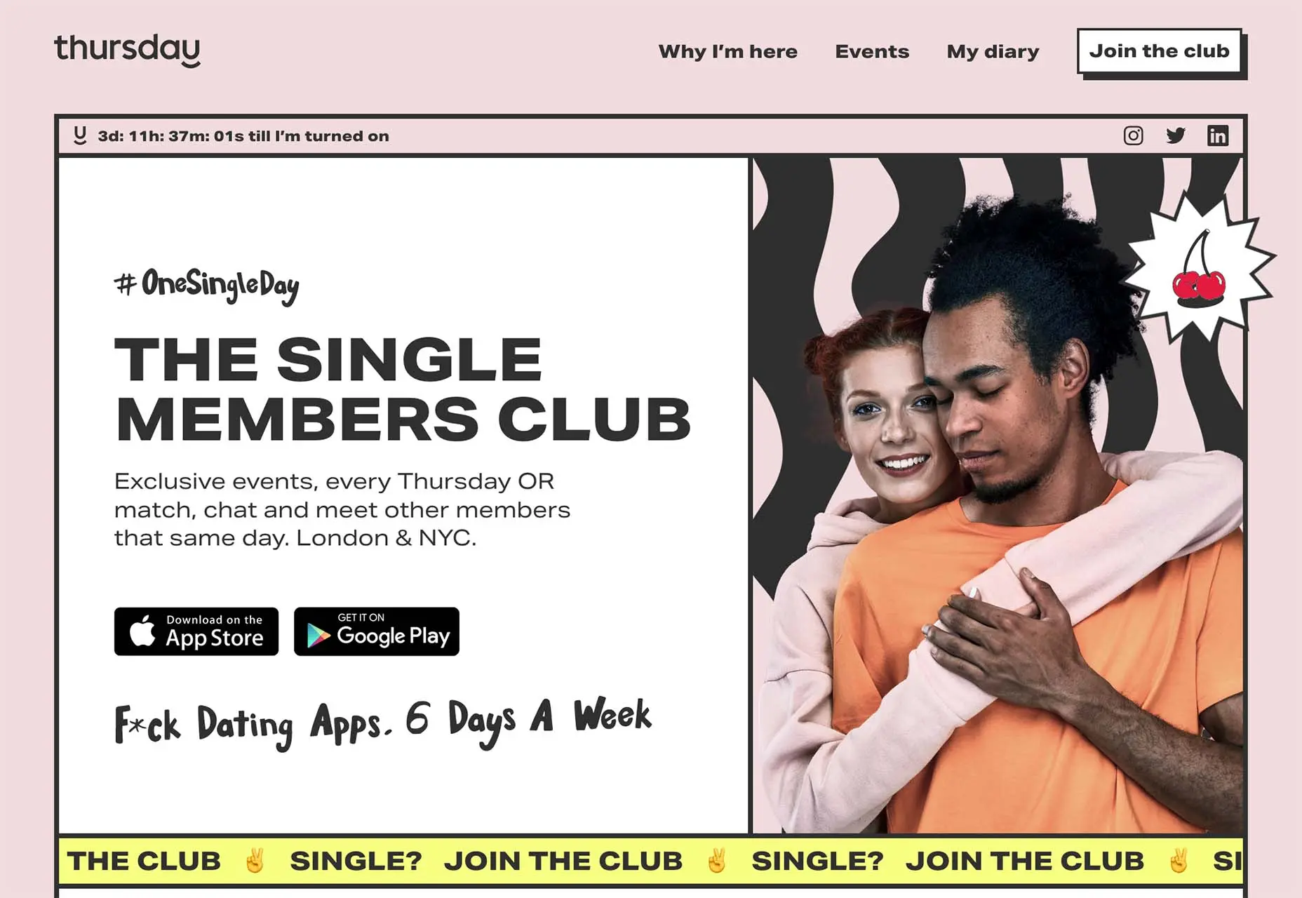
Thursday is a dating website/app for singles. It has a contemporary feel to it, and the pink is muted to the point of being beige. For users, the question is whether it has enough of a feel to appeal to a wide range of people. Something that would appear to be crucial in a dating app.
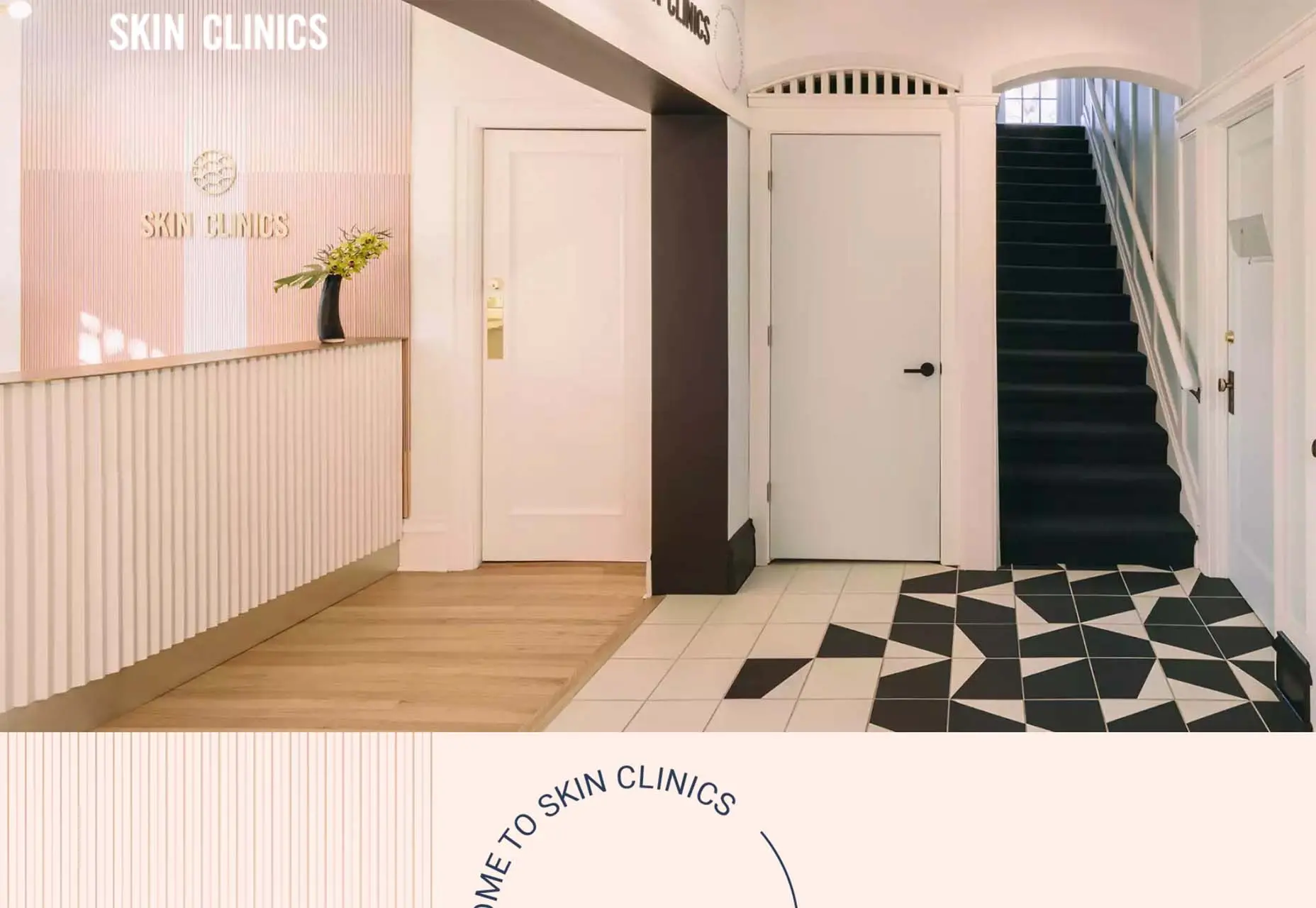
On their website, and in their offices, Skin Clinics goes all-in with pink tones. This is one of those times when I’m not sure how I feel about the colour. It’s wonderful that it’s not as clinical as all white, but this isn’t the hue of all skin. It can give you an uneasy feeling about the design and facility as a whole.
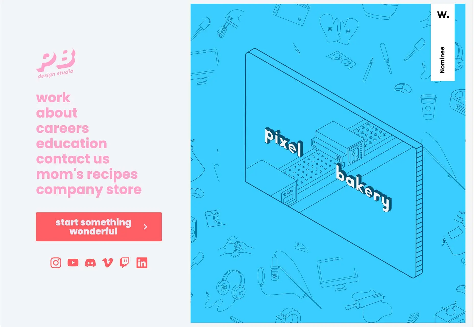
Pixel Bakery’s design, which is weirdly infantile, uses a few tones of pink. Maybe it’s the almost baby blue combined with the yin and yang contrast. Then there’s the fact that nothing seems to “fit” in terms of design. The background is pale pink, with a darker pink logo and lettering, and almost crimson pink calls to action. There’s a lot to take in visually here.
Conclusion
What are your thoughts on all of this month’s popular designs? Do they seem like design trends you’d be interested in trying? Web design trends are fascinating in that they almost appear to catch on – someone attempts something new, and others continue to utilise revisions of the design. Sometimes these concepts are fantastic, and other times they fall flat.
It’s a wonderful exercise to consider trends without concluding that you need to use them; it can also serve as a lesson in what not to do with your own design.

